Motorcycle Navigation
Motorcycle Navigation
Motorcycle Navigation

Responsibilities
UI, UX, System Design
Client
Gogoro
Duration
6 months
Platform
In-vehicle System (Android)
Overview
This project focused on optimizing Gogoro’s integrated navigation system, a product that sits at the intersection of hardware, software, and real-world riding conditions.
The background was the launch of a new vehicle model equipped with a 10.25-inch touch display — the first of its kind in our lineup. This wasn’t just a larger screen. It represented an opportunity to rethink how navigation should work on a motorcycle, where attention, safety, and environmental conditions matter far more than visual richness alone.
My role went beyond interface design. The project required learning new technical domains, collaborating closely with engineers, and making design decisions under strict hardware and safety constraints.
My Role
Led UX & UI design for the in-vehicle navigation system
Worked closely with hardware, system, and backend engineers
Researched existing in-car and motorcycle navigation systems
Designed interaction models, information hierarchy, and visual modes
Balanced usability, performance, and riding safety
From the start, the project presented three major challenges.
1. Hardware Constraints
This was my first project deeply involving hardware integration.
The vehicle system had limited GPU performance. Rendering overly detailed maps, dense landmarks, or complex visual effects would directly impact system responsiveness. Every design decision needed to balance visual clarity and system performance.
Key design consideration:
Design for reliability first, not visual abundance.
2. Map Data & Rendering
To work effectively on this project, I learned to use professional map-authoring tools, which introduced a new level of complexity.
Each road type could be configured differently depending on zoom level — including color, thickness, and opacity. On top of that, map data required regular updates, which raised questions around data management and system architecture.
This pushed me to think not just about UI, but about how design decisions scale technically.
3. Environmental Factors
Unlike cars, motorcycles operate in highly variable environments:
Harsh sunlight
Low-light nighttime conditions
Rain and visual obstruction
Loud ambient noise
Navigation had to remain readable and understandable across all of these scenarios. Visual design alone wasn’t enough — audio guidance also needed to be clear and recognizable in noisy conditions.
Research & Principles
The research focused on two main aspects:
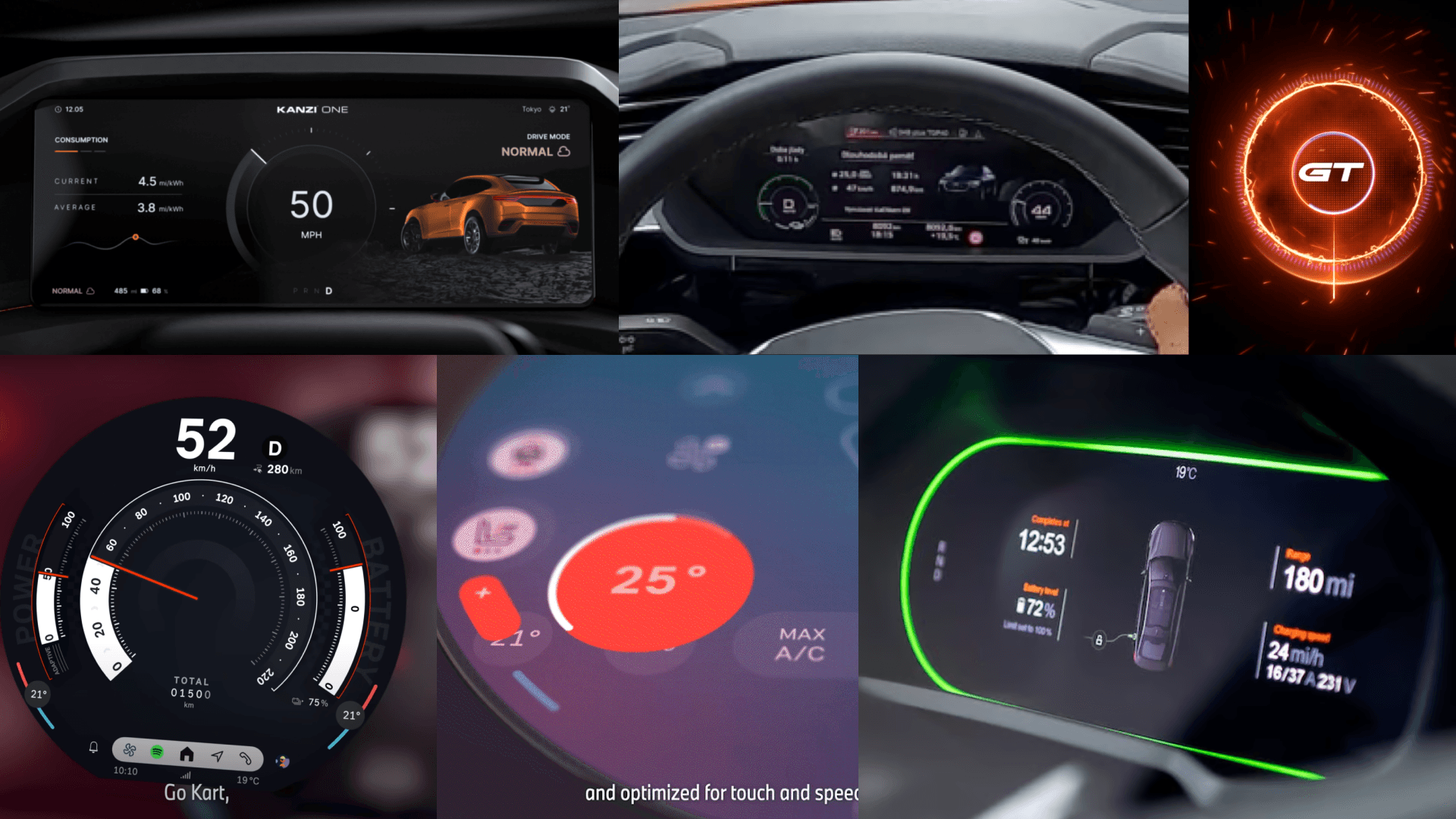
Visual presentation — most systems rely on dark backgrounds and high-contrast elements to maintain readability in different lighting conditions.
Information structure — how speed, vehicle status, and navigation can coexist without overwhelming the rider.
From this research, we distilled several guiding principles:
High readability at a glance
Clear information hierarchy
Important actions placed within easy reach
Simple, predictable interactions
After understanding technical constraints and market patterns, we identified three major user pain points.
Lack of Integrated Navigation
Most motorcycles lack built-in navigation. Even when available, it often provides only basic directional cues, forcing riders to rely on external devices.
Reliance on Smartphones
Many riders use smartphones for navigation, but this introduces serious issues:
Vibration can damage camera stabilization hardware
Devices are exposed to rain and harsh weather
Mounting and visibility are inconsistent
Battery Swap Discovery
When battery levels run low, riders must:
Stop the vehicle
Take out their phone
Open an app to find a battery swap station
This process is inconvenient, especially under time pressure or bad weather.
Visual Exploration & Direction
In early exploration, I experimented with bolder visual styles — high-contrast colors and abstract graphical elements.
However, usability testing showed that highly stylized visuals reduced information clarity, especially while riding. In this context, speed of comprehension mattered more than visual personality.
We ultimately chose a more neutral, restrained design language — less expressive, but far more usable and trustworthy in motion.
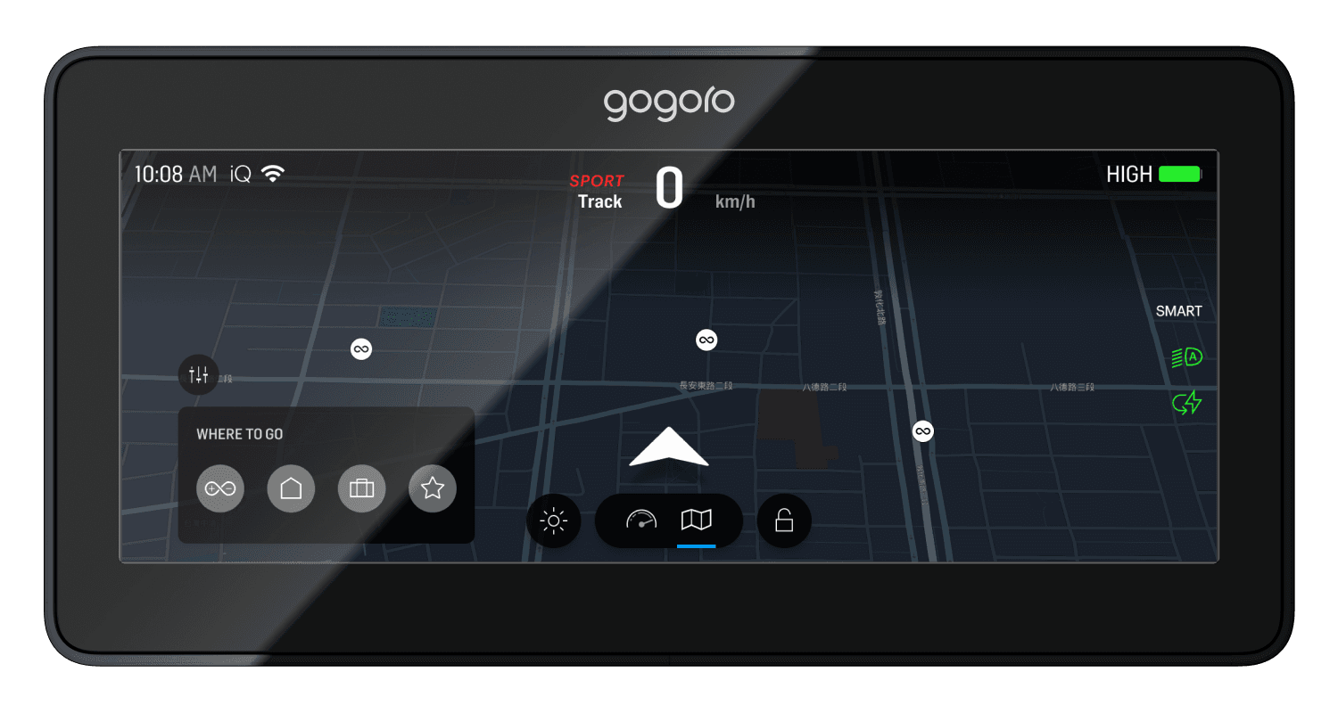
Map Exploration & Destination Selection
In idle mode, riders can freely explore the map via touch.
Quick-access shortcuts in the lower-left corner allow one-tap navigation to frequently used destinations such as home or work, which can be preconfigured in the Gogoro mobile app.
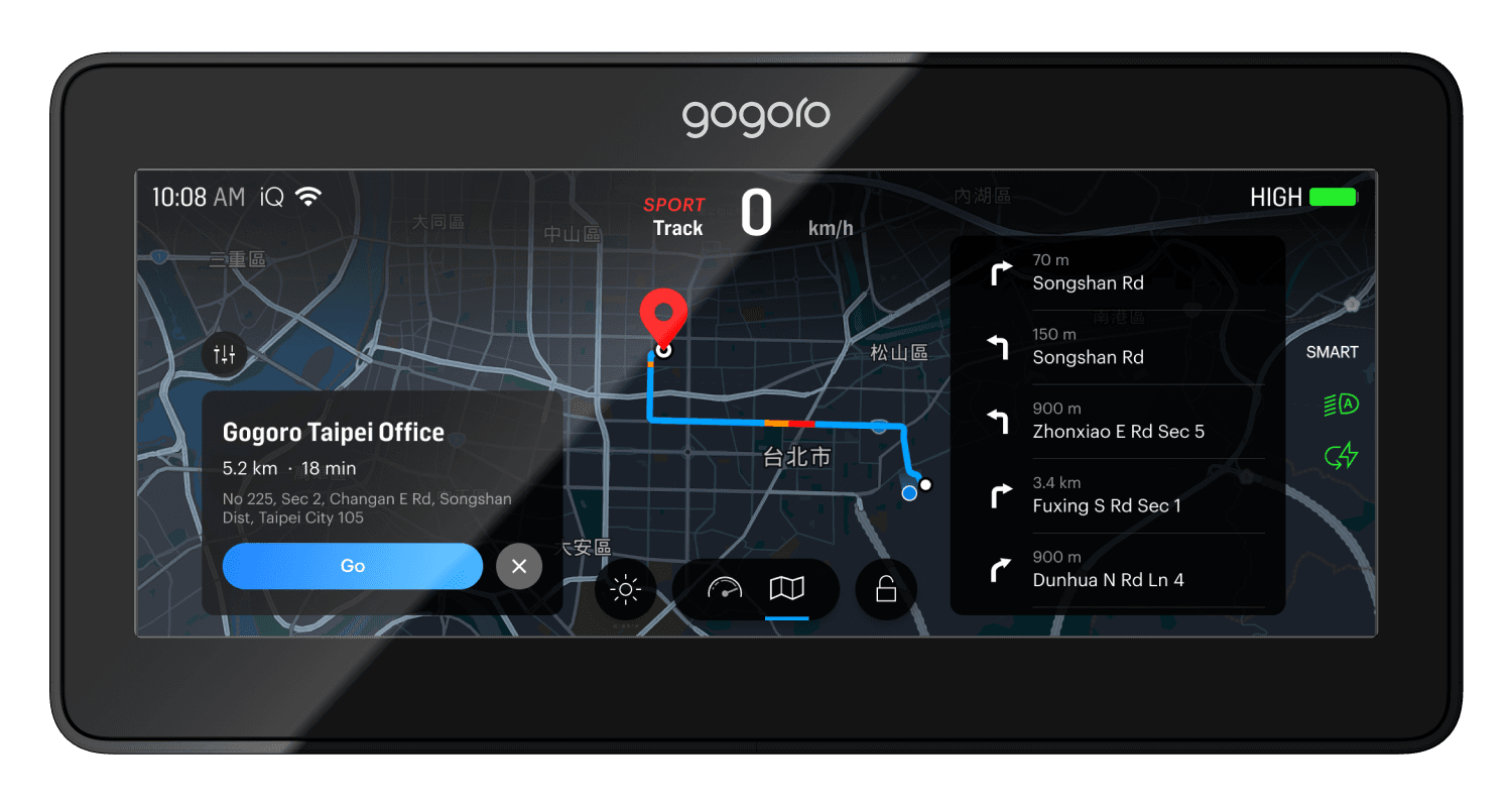
Route Preview
Once a destination is selected, the system presents a route overview, including estimated time, distance, and major turns. This gives riders a mental model of the journey before starting.
Active Navigation
During navigation:
Left side displays journey-related information (ETA, remaining distance)
Right side focuses on the next turn indicator
This layout aligns with natural visual focus while riding.
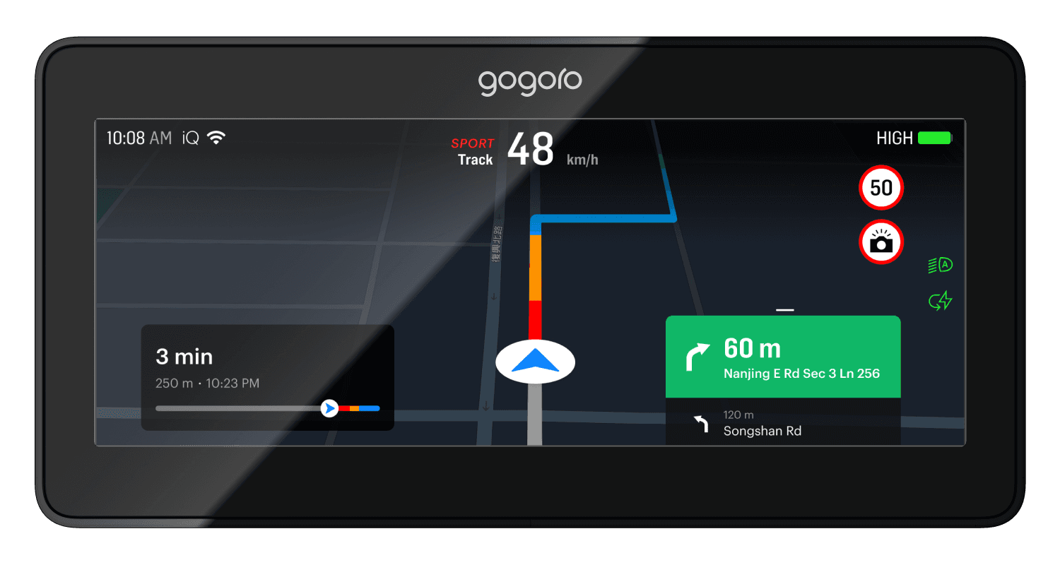
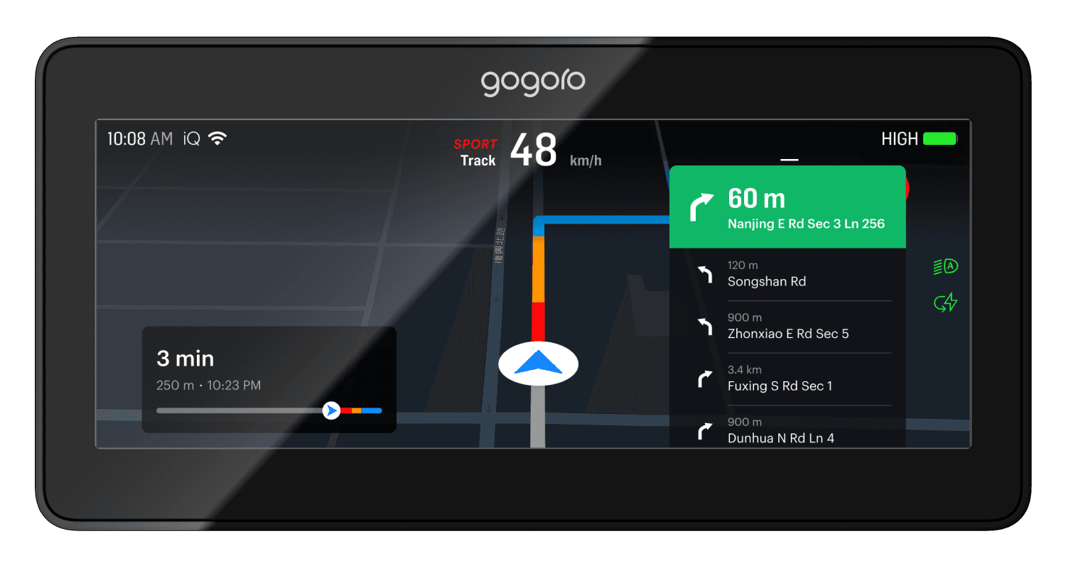
Expandable Turn Panel
The turn indicator panel is interactive.
By swiping upward, riders can preview upcoming turns — especially helpful in complex intersections — without disrupting the main navigation view.
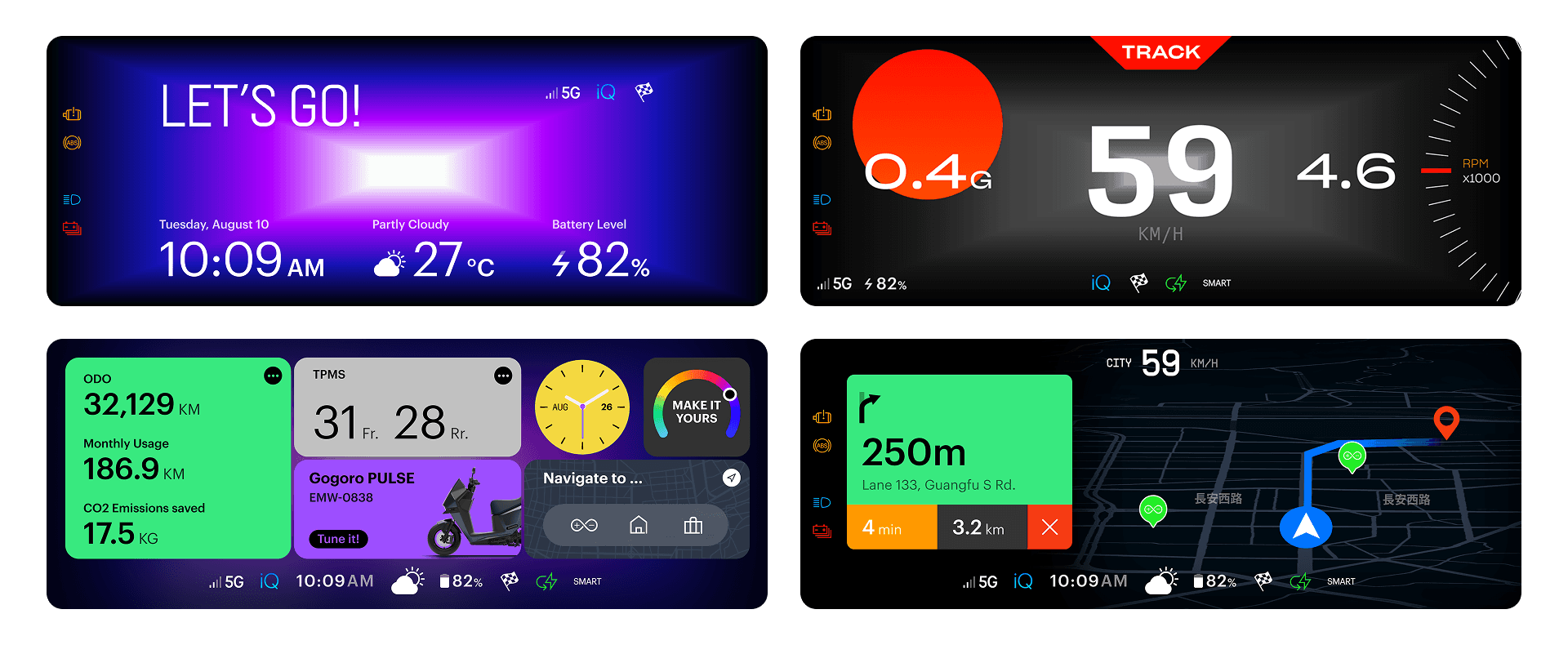
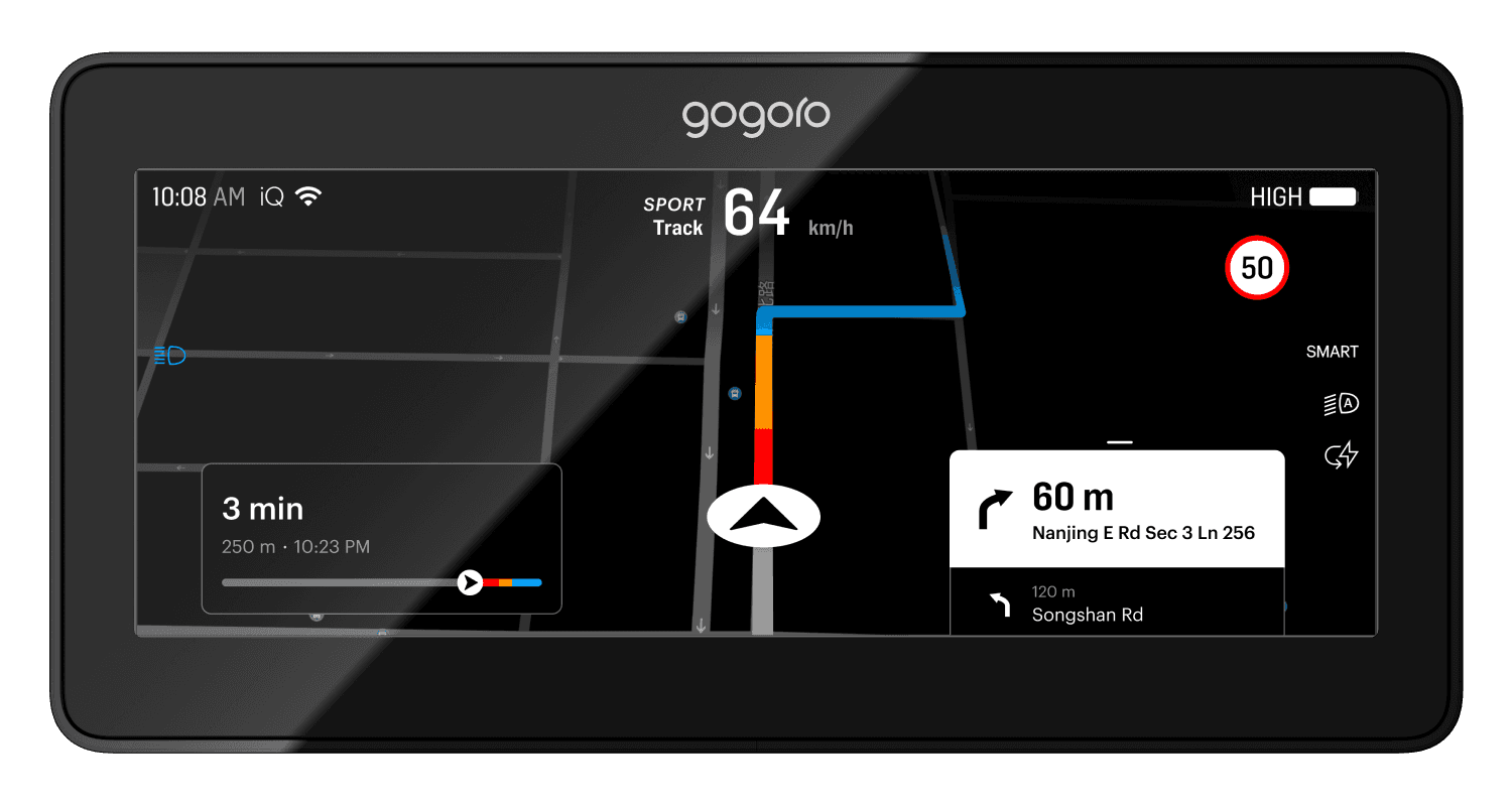
Adaptive Display Modes
To address environmental variability, we designed two visual modes:
Standard Mode
Richer map detail and layered visual hierarchyHigh-Contrast Mode
Automatically activated in strong sunlight, emphasizing key navigation information while simplifying secondary details
Crucially, all information positions remain consistent across modes, minimizing cognitive load and re-learning.
User Experience
Riders now have a fully integrated navigation system without relying on external devices.
Battery swap discovery, in particular, became significantly faster and more intuitive.
Technical Achievement
Despite hardware constraints, we achieved smooth performance through optimized map rendering and routing logic.
Environmental adaptation ensured reliability across lighting and weather conditions.
Business Value
The navigation system significantly increased product competitiveness and received strong positive user feedback.
More importantly, the underlying system architecture enables future navigation enhancements.
Takeaways
This project resulted in three major personal takeaways:
Hardware awareness matters — understanding system architecture directly improves design decisions
Performance is a design constraint, not just an engineering concern
Cross-functional collaboration is essential when designing real-world systems
These learnings continue to influence how I approach complex, system-level design problems.
Overview
This project focused on optimizing Gogoro’s integrated navigation system, a product that sits at the intersection of hardware, software, and real-world riding conditions.
The background was the launch of a new vehicle model equipped with a 10.25-inch touch display — the first of its kind in our lineup. This wasn’t just a larger screen. It represented an opportunity to rethink how navigation should work on a motorcycle, where attention, safety, and environmental conditions matter far more than visual richness alone.
My role went beyond interface design. The project required learning new technical domains, collaborating closely with engineers, and making design decisions under strict hardware and safety constraints.
My Role
Led UX & UI design for the in-vehicle navigation system
Worked closely with hardware, system, and backend engineers
Researched existing in-car and motorcycle navigation systems
Designed interaction models, information hierarchy, and visual modes
Balanced usability, performance, and riding safety
From the start, the project presented three major challenges.
1. Hardware Constraints
This was my first project deeply involving hardware integration.
The vehicle system had limited GPU performance. Rendering overly detailed maps, dense landmarks, or complex visual effects would directly impact system responsiveness. Every design decision needed to balance visual clarity and system performance.
Key design consideration:
Design for reliability first, not visual abundance.
2. Map Data & Rendering
To work effectively on this project, I learned to use professional map-authoring tools, which introduced a new level of complexity.
Each road type could be configured differently depending on zoom level — including color, thickness, and opacity. On top of that, map data required regular updates, which raised questions around data management and system architecture.
This pushed me to think not just about UI, but about how design decisions scale technically.
3. Environmental Factors
Unlike cars, motorcycles operate in highly variable environments:
Harsh sunlight
Low-light nighttime conditions
Rain and visual obstruction
Loud ambient noise
Navigation had to remain readable and understandable across all of these scenarios. Visual design alone wasn’t enough — audio guidance also needed to be clear and recognizable in noisy conditions.
Research & Principles
The research focused on two main aspects:
Visual presentation — most systems rely on dark backgrounds and high-contrast elements to maintain readability in different lighting conditions.
Information structure — how speed, vehicle status, and navigation can coexist without overwhelming the rider.
From this research, we distilled several guiding principles:
High readability at a glance
Clear information hierarchy
Important actions placed within easy reach
Simple, predictable interactions
After understanding technical constraints and market patterns, we identified three major user pain points.
Lack of Integrated Navigation
Most motorcycles lack built-in navigation. Even when available, it often provides only basic directional cues, forcing riders to rely on external devices.
Reliance on Smartphones
Many riders use smartphones for navigation, but this introduces serious issues:
Vibration can damage camera stabilization hardware
Devices are exposed to rain and harsh weather
Mounting and visibility are inconsistent
Battery Swap Discovery
When battery levels run low, riders must:
Stop the vehicle
Take out their phone
Open an app to find a battery swap station
This process is inconvenient, especially under time pressure or bad weather.
Visual Exploration & Direction
In early exploration, I experimented with bolder visual styles — high-contrast colors and abstract graphical elements.
However, usability testing showed that highly stylized visuals reduced information clarity, especially while riding. In this context, speed of comprehension mattered more than visual personality.
We ultimately chose a more neutral, restrained design language — less expressive, but far more usable and trustworthy in motion.
Map Exploration & Destination Selection
In idle mode, riders can freely explore the map via touch.
Quick-access shortcuts in the lower-left corner allow one-tap navigation to frequently used destinations such as home or work, which can be preconfigured in the Gogoro mobile app.
Route Preview
Once a destination is selected, the system presents a route overview, including estimated time, distance, and major turns. This gives riders a mental model of the journey before starting.
Active Navigation
During navigation:
Left side displays journey-related information (ETA, remaining distance)
Right side focuses on the next turn indicator
This layout aligns with natural visual focus while riding.
Expandable Turn Panel
The turn indicator panel is interactive.
By swiping upward, riders can preview upcoming turns — especially helpful in complex intersections — without disrupting the main navigation view.
Adaptive Display Modes
To address environmental variability, we designed two visual modes:
Standard Mode
Richer map detail and layered visual hierarchyHigh-Contrast Mode
Automatically activated in strong sunlight, emphasizing key navigation information while simplifying secondary details
Crucially, all information positions remain consistent across modes, minimizing cognitive load and re-learning.
User Experience
Riders now have a fully integrated navigation system without relying on external devices.
Battery swap discovery, in particular, became significantly faster and more intuitive.
Technical Achievement
Despite hardware constraints, we achieved smooth performance through optimized map rendering and routing logic.
Environmental adaptation ensured reliability across lighting and weather conditions.
Business Value
The navigation system significantly increased product competitiveness and received strong positive user feedback.
More importantly, the underlying system architecture enables future navigation enhancements.
Takeaways
This project resulted in three major personal takeaways:
Hardware awareness matters — understanding system architecture directly improves design decisions
Performance is a design constraint, not just an engineering concern
Cross-functional collaboration is essential when designing real-world systems
These learnings continue to influence how I approach complex, system-level design problems.