Building Order from Complexity
Building Order from Complexity
Building Order from Complexity
Responsibilities
UI, UX, Design System
Client
Gogoro
Duration
6 months
Platform
iOS, Android
Overview
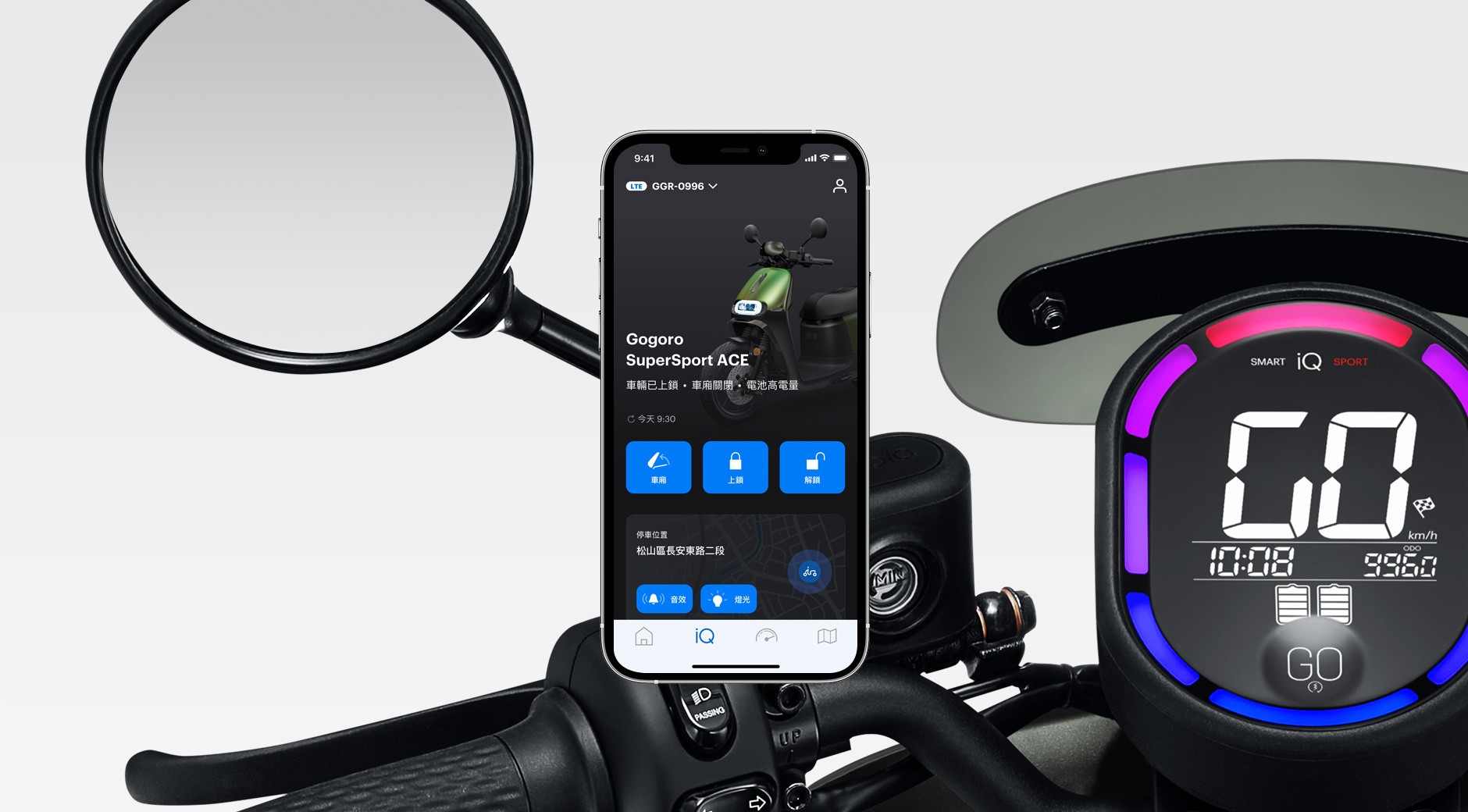
As the app continued to grow, so did its complexity.
Over time, I noticed recurring friction in our daily design work: similar features looked slightly different across the app, designers spent excessive time searching for references, and developers often needed clarification on which version of a component to use.
These issues didn’t come from poor design decisions — they were the natural result of a fast-growing product without a unified system.
This project started as an internal initiative to bring clarity, consistency, and scalability back into the product.
My Role
Led the design system initiative from problem definition to execution
Conducted component audit and consolidation
Defined design standards and usage principles
Collaborated closely with engineers and cross-functional teams
Created documentation to support long-term adoption
Problem
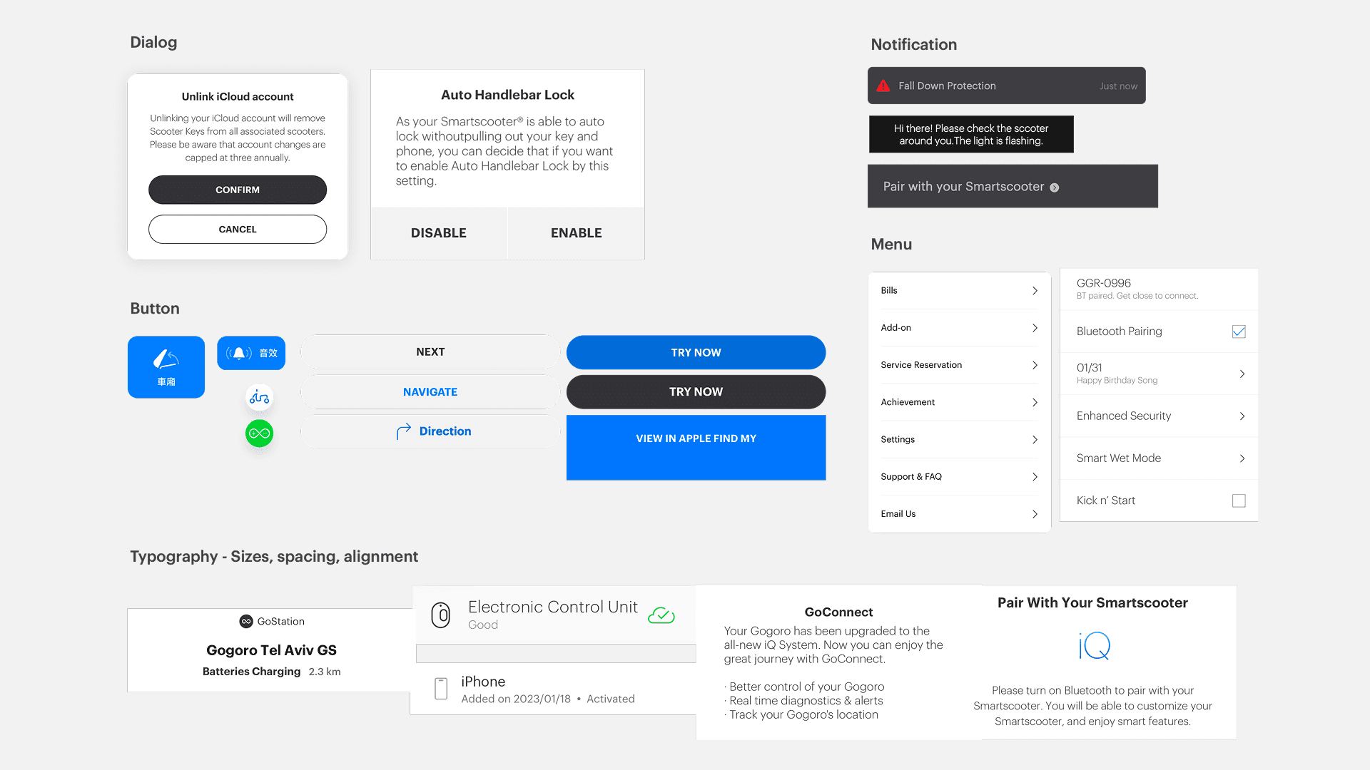
As features accumulated, the UI evolved organically rather than systematically.
Similar components existed in multiple variations
No single source of truth for component usage
Designers and developers relied on memory instead of standards
Inconsistent UI patterns led to user confusion and slower iteration
At a certain point, shipping faster actually meant creating more long-term design debt.
Goal & Strategy

I framed the project around one simple idea:
A design system should reduce decision-making, not add more rules.
To achieve this, I defined three core goals:
Component Inventory — understand what already exists
Design Standardization — reduce variation and define clear rules
Team Alignment — ensure the system works in real workflows
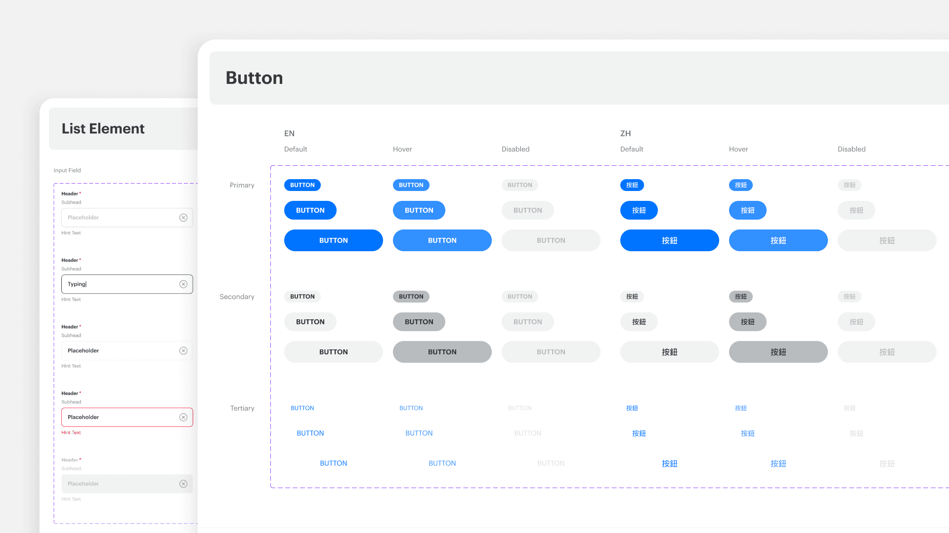
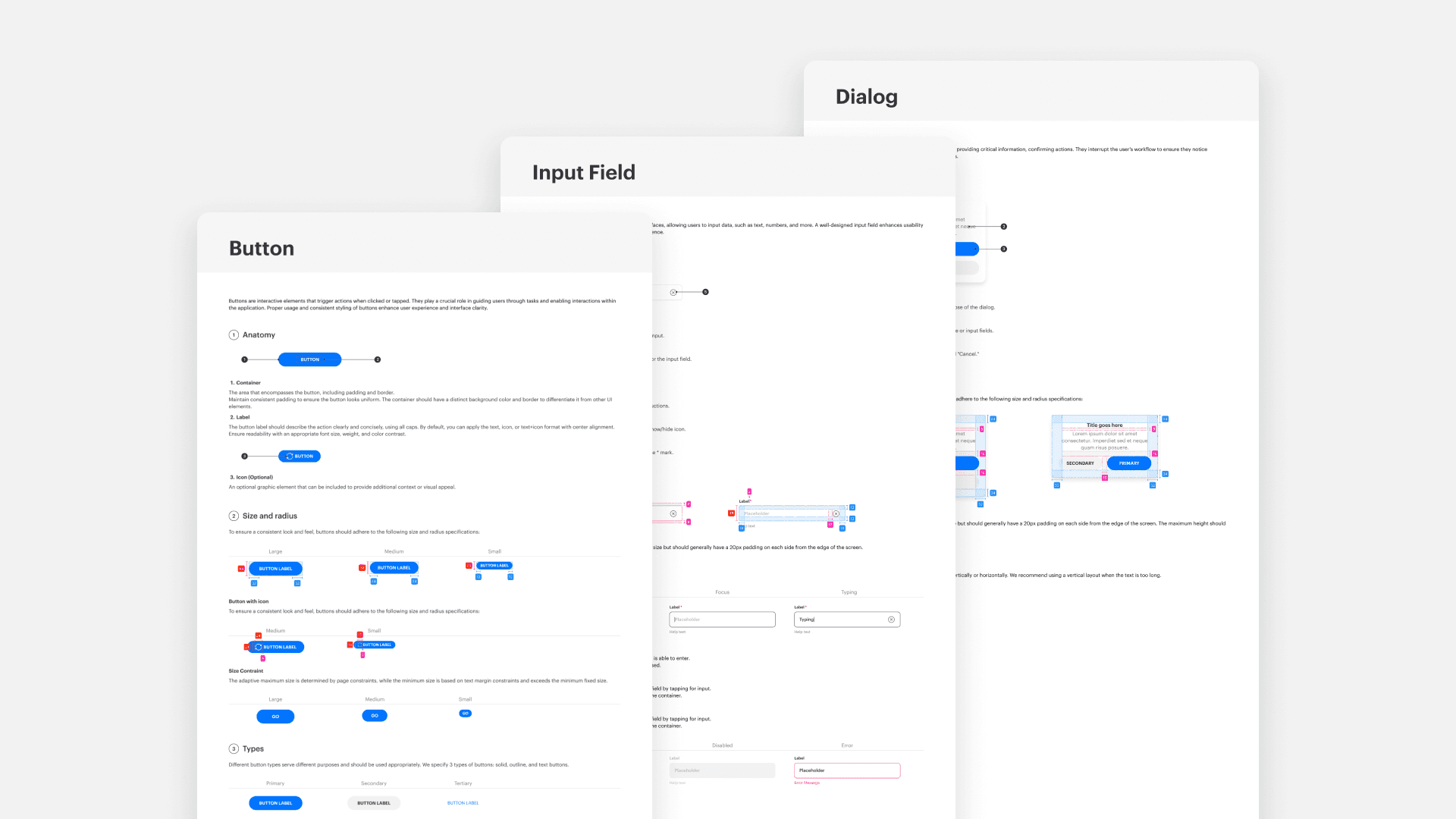
Step 1: Component Inventory
The first step was a full audit of the existing UI.
I reviewed 120+ components across different features and screens, documenting:
Where each component was used
Functional overlaps and inconsistencies
Components that were visually different but functionally identical
This phase was intentionally exhaustive.
Before proposing solutions, I needed a shared, objective view of the problem.
Key decision:
Avoid redesigning too early. First, understand the system as it actually exists.
Step 2: Standardization Through Reduction
Rather than designing new components immediately, I focused on reducing complexity.
Merged redundant components with similar behavior
Defined a consistent visual language (colors, typography, spacing)
Clarified component hierarchy and intent
Instead of asking “Which one looks better?”, the guiding question became:
“What problem does this component solve?”
Step 3: Designing for Adoption
A design system is only successful if teams actually use it.
I worked closely with engineers and other designers to ensure:
Components mapped cleanly to development logic
Usage rules were practical, not theoretical
Documentation answered real questions teams had
This collaboration shaped many decisions, especially around naming, variants, and constraints.
Key insight:
Consistency is a team agreement, not just a visual outcome.
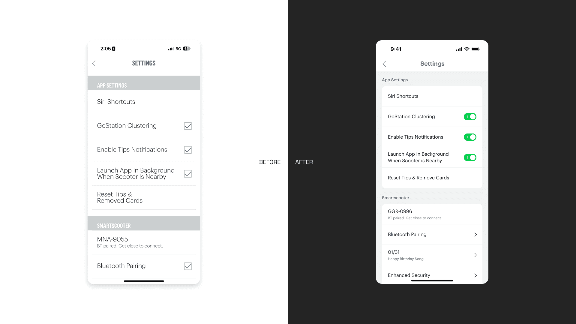
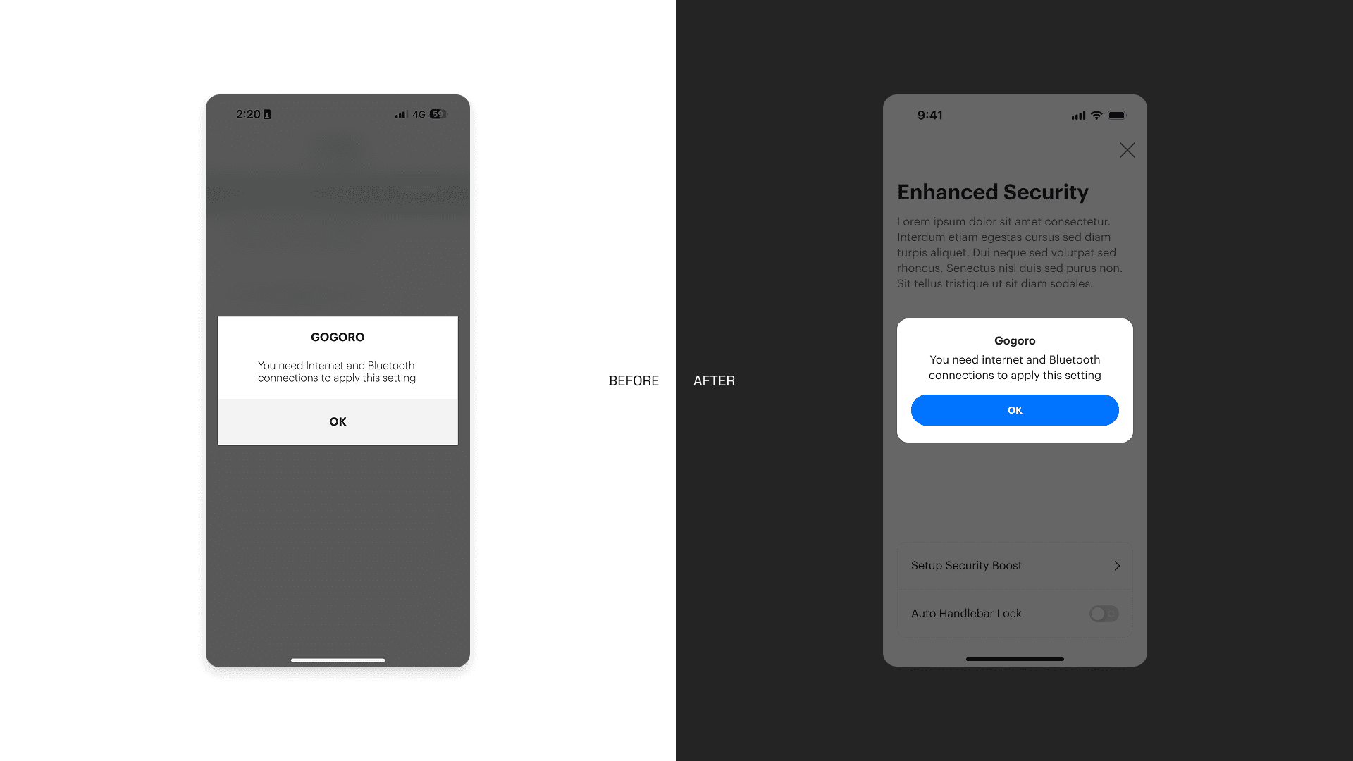
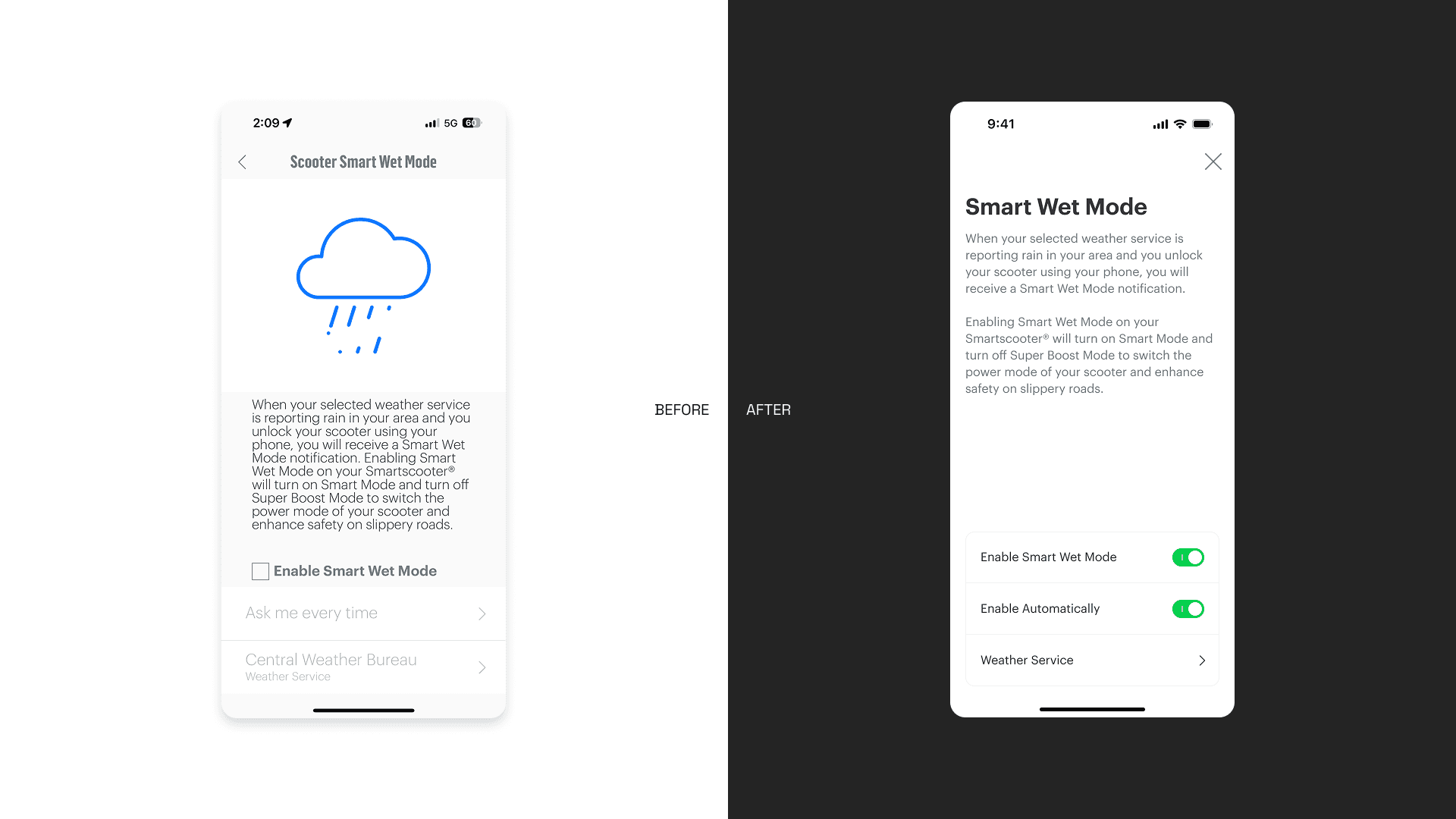
Before & After
Before the system, the same UI elements appeared in multiple inconsistent forms, slowing down both design and development.
After consolidation:
Fewer components, clearer roles
Predictable patterns across features
Easier handoff between design and engineering
The design system quickly changed how the team worked:
Faster Design Process
Designers could focus on solving problems instead of recreating UI.Reduced Development Time
Clear specifications minimized back-and-forth and rework.More Consistent User Experience
Users encountered familiar patterns, improving usability and trust.
Takeaways
This project reinforced an important lesson for me:
A design system is not about control — it’s about enabling better decisions at scale.
By investing time in structure and alignment, we created a foundation that supports future growth rather than slowing it down.
Instead of designing screens one by one, we’re now designing a system that designs itself.
Overview
As the app continued to grow, so did its complexity.
Over time, I noticed recurring friction in our daily design work: similar features looked slightly different across the app, designers spent excessive time searching for references, and developers often needed clarification on which version of a component to use.
These issues didn’t come from poor design decisions — they were the natural result of a fast-growing product without a unified system.
This project started as an internal initiative to bring clarity, consistency, and scalability back into the product.
My Role
Led the design system initiative from problem definition to execution
Conducted component audit and consolidation
Defined design standards and usage principles
Collaborated closely with engineers and cross-functional teams
Created documentation to support long-term adoption
Problem
As features accumulated, the UI evolved organically rather than systematically.
Similar components existed in multiple variations
No single source of truth for component usage
Designers and developers relied on memory instead of standards
Inconsistent UI patterns led to user confusion and slower iteration
At a certain point, shipping faster actually meant creating more long-term design debt.
Goal & Strategy
I framed the project around one simple idea:
A design system should reduce decision-making, not add more rules.
To achieve this, I defined three core goals:
Component Inventory — understand what already exists
Design Standardization — reduce variation and define clear rules
Team Alignment — ensure the system works in real workflows
Step 1: Component Inventory
The first step was a full audit of the existing UI.
I reviewed 120+ components across different features and screens, documenting:
Where each component was used
Functional overlaps and inconsistencies
Components that were visually different but functionally identical
This phase was intentionally exhaustive.
Before proposing solutions, I needed a shared, objective view of the problem.
Key decision:
Avoid redesigning too early. First, understand the system as it actually exists.
Step 2: Standardization Through Reduction
Rather than designing new components immediately, I focused on reducing complexity.
Merged redundant components with similar behavior
Defined a consistent visual language (colors, typography, spacing)
Clarified component hierarchy and intent
Instead of asking “Which one looks better?”, the guiding question became:
“What problem does this component solve?”
Step 3: Designing for Adoption
A design system is only successful if teams actually use it.
I worked closely with engineers and other designers to ensure:
Components mapped cleanly to development logic
Usage rules were practical, not theoretical
Documentation answered real questions teams had
This collaboration shaped many decisions, especially around naming, variants, and constraints.
Key insight:
Consistency is a team agreement, not just a visual outcome.
Before & After
Before the system, the same UI elements appeared in multiple inconsistent forms, slowing down both design and development.
After consolidation:
Fewer components, clearer roles
Predictable patterns across features
Easier handoff between design and engineering
The design system quickly changed how the team worked:
Faster Design Process
Designers could focus on solving problems instead of recreating UI.Reduced Development Time
Clear specifications minimized back-and-forth and rework.More Consistent User Experience
Users encountered familiar patterns, improving usability and trust.
Takeaways
This project reinforced an important lesson for me:
A design system is not about control — it’s about enabling better decisions at scale.
By investing time in structure and alignment, we created a foundation that supports future growth rather than slowing it down.
Instead of designing screens one by one, we’re now designing a system that designs itself.