Payment Experience Redesign
Payment Experience Redesign
Payment Experience Redesign
Responsibilities
UI, UX, Product Design
Client
Binance
Duration
1.5 month
Platform
iOS, Android
Overview
This project focused on redesigning the Binance Card Mini App, transitioning it from a webview-based implementation to a native app experience.
As the product matured, the limitations of a webview approach became increasingly visible. While it allowed faster initial development, it constrained interaction quality, performance, and scalability. Given that Binance Card is a high-frequency payment feature used in everyday scenarios, improving the core experience became a necessary step rather than an optional enhancement.
Problem
Prior to the redesign, the product showed clear signs of friction:
The interface was visually dense, making key information harder to identify
Information hierarchy was unclear, especially in time-sensitive use cases
Webview-based interactions lacked responsiveness and native feedback
Engineering resources were limited, requiring careful prioritization
Although the CSAT score was 72.09%, user feedback indicated that the experience could be clearer, faster, and more predictable.
Solution
The redesign centered on simplifying structure and strengthening core flows, rather than adding new features.
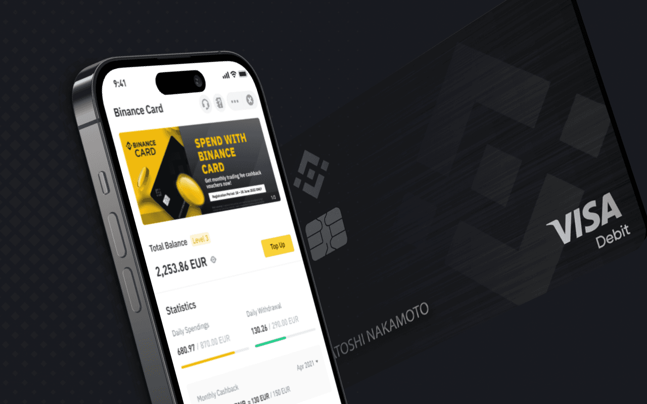
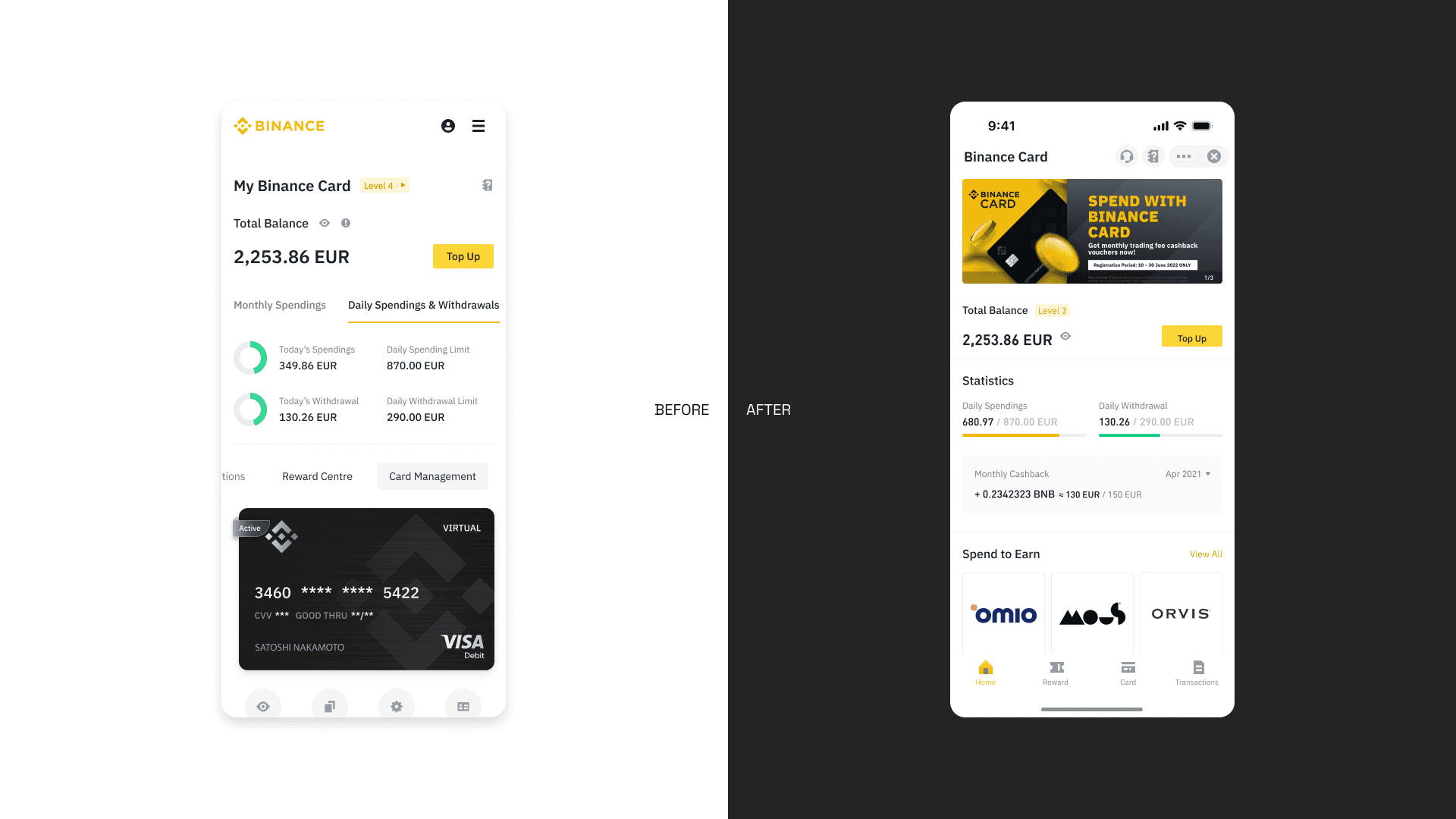
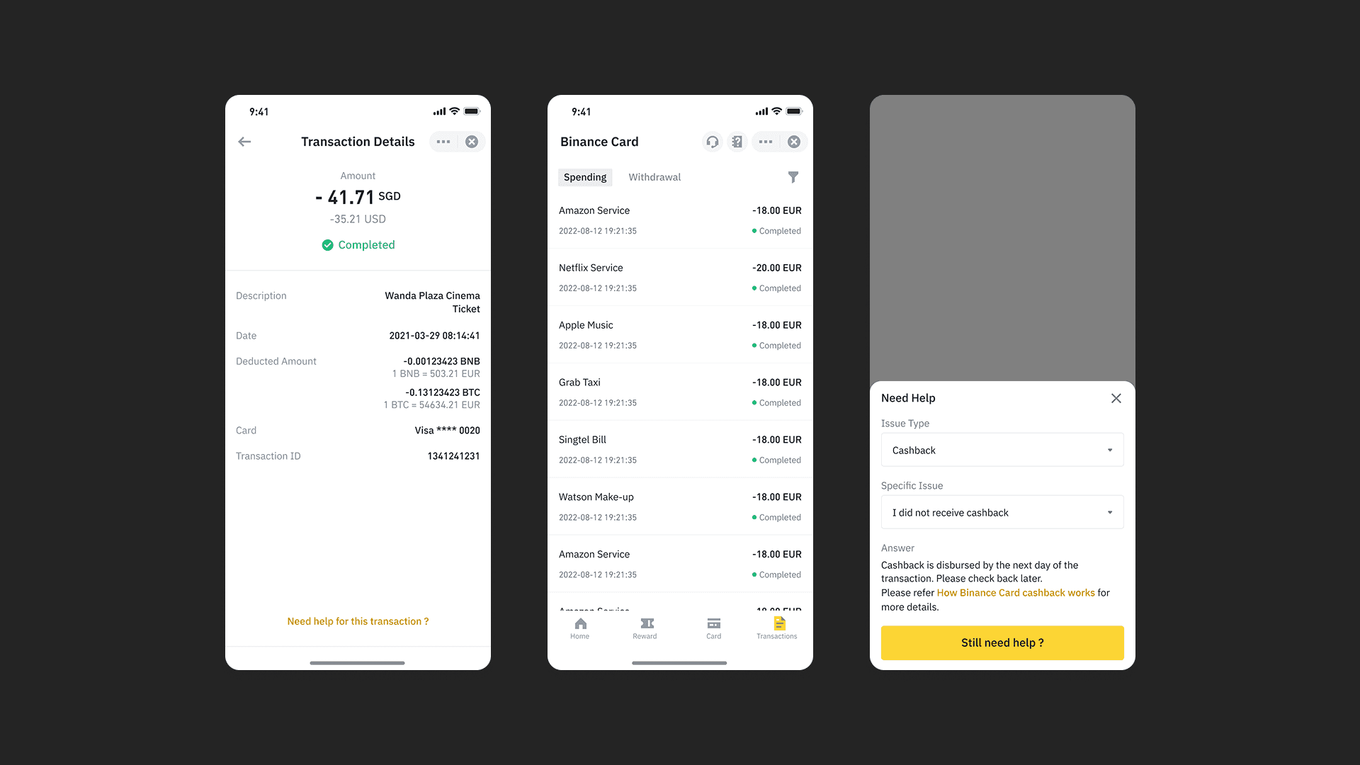
Reorganized the interface to surface critical information, such as balance and recent activity, at first glance
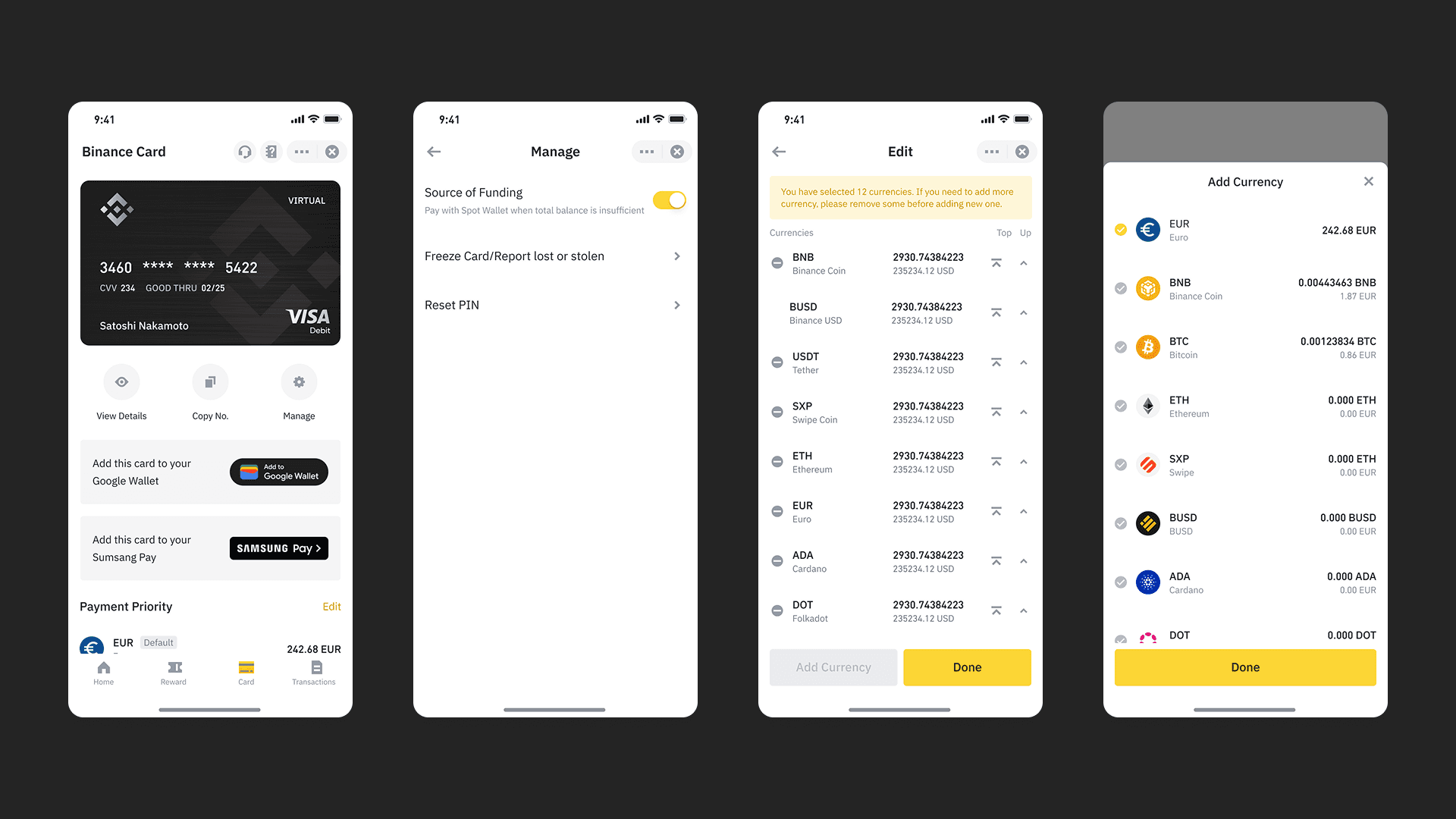
Defined four core service pillars — balance, card management, transfers, and transactions — to guide layout and navigation decisions
Migrated key user flows to native components to improve performance and interaction feedback
Adopted a phased development approach to focus limited resources on high-impact improvements
Design decisions were grounded in real usage behavior, such as retaining a prominent card visual to reinforce confidence during in-store payments.
Takeaways
Improving foundational experiences often delivers more value than adding features
Small, focused changes can have meaningful impact at scale
Constraints help clarify priorities and sharpen decision-making
Strong UX emerges from aligning user needs, technical realities, and system consistency
Overview
This project focused on redesigning the Binance Card Mini App, transitioning it from a webview-based implementation to a native app experience.
As the product matured, the limitations of a webview approach became increasingly visible. While it allowed faster initial development, it constrained interaction quality, performance, and scalability. Given that Binance Card is a high-frequency payment feature used in everyday scenarios, improving the core experience became a necessary step rather than an optional enhancement.
Problem
Prior to the redesign, the product showed clear signs of friction:
The interface was visually dense, making key information harder to identify
Information hierarchy was unclear, especially in time-sensitive use cases
Webview-based interactions lacked responsiveness and native feedback
Engineering resources were limited, requiring careful prioritization
Although the CSAT score was 72.09%, user feedback indicated that the experience could be clearer, faster, and more predictable.
Solution
The redesign centered on simplifying structure and strengthening core flows, rather than adding new features.
Reorganized the interface to surface critical information, such as balance and recent activity, at first glance
Defined four core service pillars — balance, card management, transfers, and transactions — to guide layout and navigation decisions
Migrated key user flows to native components to improve performance and interaction feedback
Adopted a phased development approach to focus limited resources on high-impact improvements
Design decisions were grounded in real usage behavior, such as retaining a prominent card visual to reinforce confidence during in-store payments.
Takeaways
Improving foundational experiences often delivers more value than adding features
Small, focused changes can have meaningful impact at scale
Constraints help clarify priorities and sharpen decision-making
Strong UX emerges from aligning user needs, technical realities, and system consistency